How the Bootstrap Grid Works


Bootstrap is a popular frontend open source toolkit. The seemingly inescapable CSS framework, has many valuable features. The most basic and powerful of these arguably is its mobile-first 12-column grid layout system. The Bootstrap grid has been around in its current form since v3.0 in 2013, and (to our collective relief) remains the same in v.4.0.
Yet the grid system can present a steep learning curve, and many developers tend to just throw containers, rows, and columns into their pages without understand how these elements work together. Instead of just grumbling about this (which I reserve the right to continue doing), I thought I would try to help unlock the relationship between containers, rows, and columns in hopes of improving both understanding and markup.
The Bootstrap docs lay out the system in pretty stark terms, but it’s hard to grok this without getting inside of it. I’ll paraphrase here, and encourage you to read the original:
- There are three major components: containers, rows, and columns.
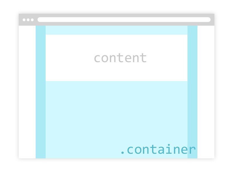
- Containers center your site’s content in the browser window.
- Rows are horizontal groups of columns.
- Content should be placed within columns, and only columns may be immediate children of rows.
- Column classes determine the width of the column.
What does this look like visually? I’m glad you asked.

The light blue area is where the content goes. The dark blue area represents padding on either side of the container, about which we’ll learn more in just a minute.
As you can see above, if your intention is for your content always to take up the full width of the container, there’s no need for rows or columns. This confusion leads to one of my pet peeves:
<div class="container">
    <div class="row">
        <div class="col-sm-12">Content</div>
    </div>
</div>
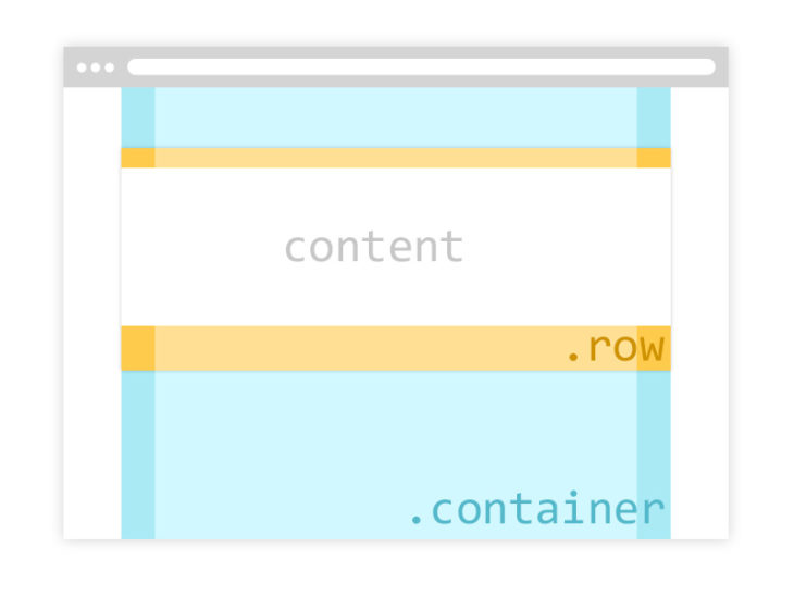
The .row div and the .col-sm-12 div are both unnecessary. Having a row with only one full-width column inside it won’t hurt anything—it’s a technically valid use of the grid. But to me it often signals a lack of understanding.
UPDATE: After talking to several colleagues who admitted they were “guilty” of doing this, I need to clarify that this is not a sin. It totally makes sense to me to write all your markup in the rows and columns structure. This makes it easier to come back and add columns later, and it leads to cleaner code if you have several rows on the page, some of which contain only one column. I realized the usage of this example that truly bothers me is as a wrapper for the rest of the page’s content. If the code above were the first thing that appeared after the opening body tag, for instance, I would be concerned.
So when do we need rows and columns? When we want to split our content into columns. (And/or we want our content to be laid out differently on different screen sizes, but I’m not going to get into breakpoints here.) Let’s look at how rows and columns work. First, consider the .row class:
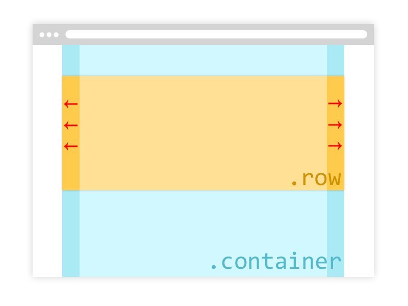
The lighter yellow area again represents the space for your content. This is important: the dark yellow area represents a negative margin on either side of the row that effectively negates the padding on the parent .container. I’ve highlighted this with red arrows; that’s how important it is. That negative margin is why columns must be the direct descendants of rows:

In this example we want our content to be only half the width of the container (6 out of a possible 12 columns wide). The light green is where content will go. The dark green represents padding on either side of the column, undoing the negative margin on the row and bringing the content back into alignment with the grid. Why all the margin/padding back and forth? Take a look at some more pet peeves:

In the left example, we’ve got a column with no rows. In the right example, a row with no columns. In both cases, our content is out of alignment with the grid, which starts just inside the dark blue area of the container (inside the padding). Now you can see the reason for the .row‘s negative margins: columns need padding on the left and right to provide a gutter between them, but the first column shouldn’t have a gutter on the left, and the last column shouldn’t have a gutter on the right.
Hopefully I’ve helped to clarify things and haven’t muddied the waters further. If you notice the left side of your grid is looking a little ragged, check to make sure your columns are directly inside a row, and your rows are inside a container.
Oh, and if you’re working in a language read right-to-left, please forget everything you just read okay thanks bye.