
Planning a UX project is a big deal, particularly if you’ve never completed one before.
To give you an idea of what’s involved, we’ve created this 22-step UX checklist. Broken down by project stage, it’s designed to give you an overview of what you should be considering and when you next launch into UX design, so that you’re as well informed as possible before you start.
While this is a general checklist, for each step, it’s good to assign ownership to a member of the project team. For some tasks it might be the UX Designer themselves, while others might be the responsibility of the Product Owner of PM. This makes sure there is accountability at all times. So where there is a specific owner we recommend to be associated with a step, we’ll mention that, but this should act as more of a guideline than a strict rule.
It’s a fair amount of information, but remember – each step doesn’t have to follow another. Feel free to tweak the process into a system that works for you. Lots of little actions add up!
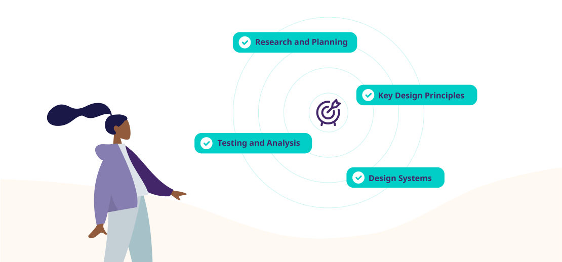
Research and planning

Successful UX projects are built on solid foundations. If you rush this stage, there’s a good chance you’ll end up with a chaotic project which isn’t nearly as aligned with user needs as it should be. No amount of work further down the line will make up for this – take your time here, and be thorough.
For Product Owners/Project Managers:
1. Set clear specifications for the project or product goal.
We’ll start with the most obvious point on this list. Consider the why and what. What are we creating? Why are we designing it? What problem are we trying to solve? And, why would anyone want to use our solution?
These questions are crucial to define the scope and objectives of your project. They lay a foundation for everything that comes after. You should emerge from this step with a clear set of goals and objectives for the project. Associate each of these goals with a measurable outcome tied to a KPI. These can change as the project progresses, but it’s good to start with some concrete objectives.
2. Assemble your team
Do you have enough talent available to pull off what you want to do?
Depending on the scope of your project, this could include graphic designers, animators, and UX writers alongside more general UX designers. Dedicated UX researchers can also be used, depending on your budget and the scope of the project. Plan for these needs upfront so you’re not hit with delays and budget overruns further down the road – think freelance if you can’t justify full-time hires, or consider outsourcing to a specialist UX design service.
3. Calculate a project budget and timeline
Like any major project for any discipline, it’s good business sense to know how long your UX project is going to take and how much it’s going to cost.
Obviously, calculating this down to the cent is a big ask. A useful way of doing this is to calculate both a best case and a worst case scenario, and budget for the worst case (adding an extra 10% onto what you’ve calculated for good measure). Be conservative here – it’s always better to complete with time and money left over than to have to ask for more and explain why.
For UX Designers/Researchers:
4. Meet your stakeholders, conduct user research and user interviews
Taking a user-centered approach is absolutely essential if you want your product to be the best it can be. Setting up some focus groups in the early stages of your project will help create a solid knowledge base for your user personas and project requirements.
As a bonus, setting them up now saves you the job of setting them up during the testing phase.
5. Create your user personas
Who’s going to use your product once it launches? What are their needs, concerns, and life circumstances, and how can your design accommodate these? Having a few model ‘personas’ down on paper makes it much easier for your team to design for these needs.
Your user personas should be informed by a good amount of field research (your focus groups play a significant role here). Once you’ve got a good handle on the questions above, sit down with your team and outline however many you need – and once complete, keep them easily accessible so that your designers can refer back to them.
6. Draw up a product requirements document
This is where you lay out which features you want in your project, which users they’re going to be for, and how these users will benefit from them. You should also include any dependencies, assumptions, system requirements and usability requirements for each feature.
A good product requirements document provides a single point of reference for everyone working on the project and avoids delays and cost drains due to misunderstandings. It’s one of the cornerstones of a successful UX project – so be thorough.
Key design principles
These are the design principles you should be keeping in mind as you start the design phase of your UX project. They’re an excellent anchor to base the more creative elements of design – the animation, the words, the color schemes – around. Keeping them in mind will imbue your team with a sense of purpose as they prototype.
7. Create a hierarchy of information
Lay out all the information your product needs to contain, and figure out some sort of hierarchy. Which bits of info are so important they need their own page, or screen? Which are less so, and how can you incorporate them into your layout?
Think about how you’re going to convey this hierarchy to your users, so that the most important information is most visible. This will involve experimenting with structure and navigation, as well as making good use of design elements (like fonts, headers, color schemes and the like) – more on that below.
8. Decide what you want to keep consistent with other applications
Current design best practices can always be improved on. That’s why we don’t have the same best practices now as we did 20 years ago. That being said – there are some basic design foundations that always work – we highly recommend Don Norman’s seminal 1988 book ‘The design of everyday things’. Essential reading for any designer.
If your user base is really used to doing things (say, closing a window by clicking on a cross) one way, it’s going to be a barrier to use if you depart from that radically. From the get-go, be clear on which of these types of common interaction you’re going to stick with, and which (if any) you’re going to improve on.
There’s a balance to be struck here. Users can – and will – get used to new ways of doing things if they can see a benefit in doing so. Equally, reinventing the wheel for the sake of it will cost you, usability-wise.
9. Think about accessibility issues
If you plan around common impairments, the potential audience for your product increases significantly. It’s also a good thing to do in itself. There are no losers when it comes to making your product more accessible.
Think about how users with impairments might navigate your sign in process, and whether there are any features you could add which would make it easier for them to use your product. Common ideas here include compatibility with read-aloud software, alternative login methods, and alternative fonts and color schemes for those with reading impairments like dyslexia.
The nitty gritty
The ‘design’ part of the process. This is where you start to shape how your product looks and feels. Make sure that, whatever your design ends up looking like, you stick to the principles you discussed during the previous step.
10. Create a design system to follow
A design system is a set of guidelines and reusable components for a project. We like to use design systems with elements that can be used interchangeably. A solid design system is key to align teams and build consistent products, especially in large teams/projects.
Design systems take a little time to set up initially, but in later stages they help speed things up and make for a more coherent end-product. Also it helps with revisions – if it’s a modular system, you can still go back and revise the design of a certain element, and easily track where it’s used throughout your product design and update as needed.
Don’t get carried away here. Design systems can almost become products in themselves. To keep things moving stick to a lightweight or existing design system. And remember – a design system is a living thing – it can evolve and grow along with the project too.
Some good examples are Spectrum by Adobe, Material Design from Google and Airbnb’s design system.
11. Create prototypes
Before designing actual screens it’s good to run through a prototyping process. Prototypes can assist with ideation and help map out user flows.
It’s important to test out ideas to see how your users respond to them. At Tivix, we often develop multiple prototypes of a product before deciding on a winner. Prototyping generally begins with creating lo-fi or paper prototypes before moving to more detailed and interactive versions.
12. Choose your fonts
This is primarily the work of a UI designer, but since font choices can have a significant impact on accessibility and usability, it’s good to think carefully about choices in coordination with your UX team. Which fonts will you use for your app or website? Will you use the same ones for headings as body text? Are they consistent with the image your brand wants to project?
All important things to consider whilst designing your product. The font is one of the most obvious visual elements of your product, and dictates how well your users can read and process key info. Accessibility should be a priority here as well – some fonts are much easier to read for those with visual impairments or learning disabilities, for example.
13. Design your page layouts
How should you present the various elements of your product to maximize ease of use?
Remember, space is your friend – overcrowded screens look intimidating, and risk your users missing something important. If you have a lot of information to present, consider using collapsible subheads so that users can process it all on their own terms.
You should cover site or app navigation as part of this. Does your menu demonstrate a clear hierarchy of information, and is it easy for users to understand where they might find something from first principles?
14. Create your transitions
A good transition helps guide a user to the next stage of an interaction, helping you signpost what their next action should be. Top of the list for this step should be responsiveness (acknowledging when a user has completed an action) and clarity (keeping things moving towards a single, obviously-signposted conclusion and avoiding too much motion at once).
15. Identify common micro-interactions
Micro-interactions are interactions that trigger a single, self-contained user journey – think liking a post, changing a password, or simply logging in. They are the bread and butter of your product’s interaction design…but users will rarely notice them unless they go wrong.
It’s therefore super important to map these out in detail. Think about what triggers them, what the end goal is and how best to present the steps the user needs to take to achieve this.
16. Design any images you need
If you’re using icons or vector graphics for your product, you’ll need to consider where you want them, and how you’d like them to fit in with the overall design. Ideally, any visual input needs to remain consistent with ‘external’ branding, color and style-wise.
17. Write your product copy
Many design teams use lorem-ipsum copy during the prototyping phase, only bringing in a copywriter right at the end of the process. In many cases, this is an opportunity lost.
Design your product content like you would for everything else, perhaps bringing in a specialist UX writer to work alongside your visual designers. Wording is central to the overall user experience, and needs to work together with the more visual aspect of your product to create something that’s easy to use and on-brand. You’ll also have more scope to tweak and adjust if you write your copy earlier on in the process.
Sit down with your marketing team and make sure you’re up to date with their activities – major ad campaigns right down to everyday social activity. The language used in your product should mirror these. If you haven’t already got one, create a style guide so that everyone’s on the same page.
Testing and analysis

‘Would this product be useful for our users?’ is the question you’re aiming to answer here. There’s only one way to find out – testing, testing, and more testing.
18. Measure against your KPIs
You can do all the testing you want, but it will be meaningless unless you have a clear idea of what success looks like. Identify must-meet KPIs from Step 1 (these should be non-negotiable – you can’t launch without meeting them), and a few ‘ideals but not essentials’ as well.
What exactly these will look like will depend on what sort of testing you do and what you’re trying to achieve, but a few examples here could be:
- X% of users being able to create an account and login from first principles, with no help.
- No external app integration issues for any phones or tablets on your ‘10 most popular devices’ list.
- X% responses saying that the product was either ‘easy’ or ‘very easy’ to use on user surveys.
19. Create a process for implementing design improvements
Regardless of how good your product is, there will always be ways you can improve. It’s important to have methods in place for distinguishing which of these improvements are essential and time-sensitive, and which can potentially wait for a new release. Otherwise you’ll end up on a never-ending cycle of tweaks and bug-fixes.
Set up a few criteria to help you strike the right balance. For example, anything that’s remotely security-oriented should be dealt with immediately, pre-release. Minorly annoying, definitely manageable display bugs on obscure operating systems can probably wait.
20. Run surveys, focus groups, and interviews
Surveys are particularly useful as a way of identifying some base performance stats for your product, and tracking how any improvements you make affect these. Meanwhile, focus groups and in-depth interviews allow you to press more for answers. Incentives can be useful here to encourage different types of users to give you feedback.
21. Run behavioral tests
To get a deeper understanding of how easy your product is to use, and how well it fulfills its purpose, delve deeper with more explicit behavioral studies. These could include:
- A/B testing
- Session recording/heat mapping
- User panel studies
- Usability studies
22. Rinse and repeat
Once you’ve got enough feedback to make well-informed changes to your product, you’ll need to design, prototype and test them again. Using the same metrics, see whether your new tweaks and additions have improved the experience your users have whilst using your product.
UX design is all about a constant cycle of establishing user needs, designing, testing, improving, and repeating, so do build enough time into your project schedule to do this without rushing. You should also bear in mind that this doesn’t necessarily stop after you’ve launched your product – there’s always that next release to be planning for. Follow this UX checklist and you’ll be building better products in no time!


